Mount Godwin
Coffee

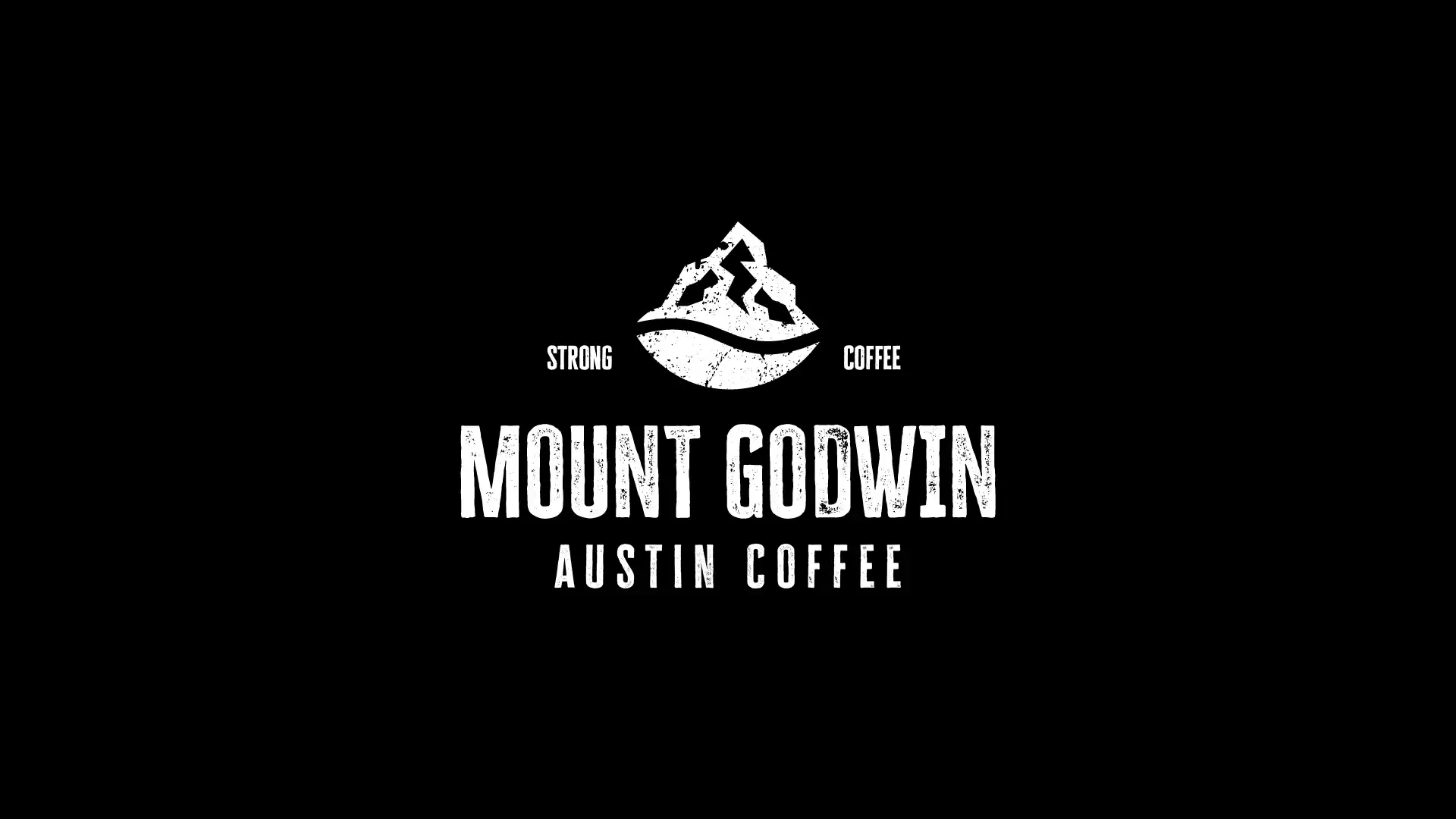
Mount Godwin Coffee is a specialty coffee brand based in Austin, Texas, known for its bold flavors and adventurous spirit. The brand identity draws inspiration from the rugged peaks of Mount Godwin (also known as K2), reflecting strength, resilience, and a love for exploration.

The goal of this project was to create a logo and brand aesthetic that communicates strength, authenticity, and premium quality while resonating with coffee lovers who seek more than just a drink—they crave an experience.

Client

Mount Godwin Coffee

Role

Logo Design

Challenges & Objectives

/ Design Concept

The concept merges two powerful elements:

  • Mountains – Symbolizing strength, endurance, and nature’s raw beauty.

  • Coffee – Represented through a clean, bold emblem and rustic textures that highlight the authenticity of the brew.

The design features a grunge-style texture to convey ruggedness and natural appeal, appealing to adventure seekers and strong coffee enthusiasts.

Typography was chosen to be bold, distressed, and vintage-inspired, reinforcing the adventurous and artisanal character of the brand.

/ Logo Elements

Mountain Icon – Represents exploration and resilience.
Circular Base – Evokes a coffee cup or a rising sun, symbolizing energy and warmth.
Tagline: Strong Coffee – A clear message about what the brand delivers.

/ Color Palette

  • Primary: Black (#000000) – Strength, sophistication, and boldness.

  • Secondary: White (#FFFFFF) – Clean contrast for clarity and impact.

Mount Godwin Coffee 2
Mount Godwin Coffee 4
Mount Godwin Coffee 3

Mount Godwin Coffee’s brand identity is a perfect blend of rugged aesthetics and modern simplicity. It speaks to those who want to start their day strong and adventurous.