Challenges & Objectives
/ Design Concept
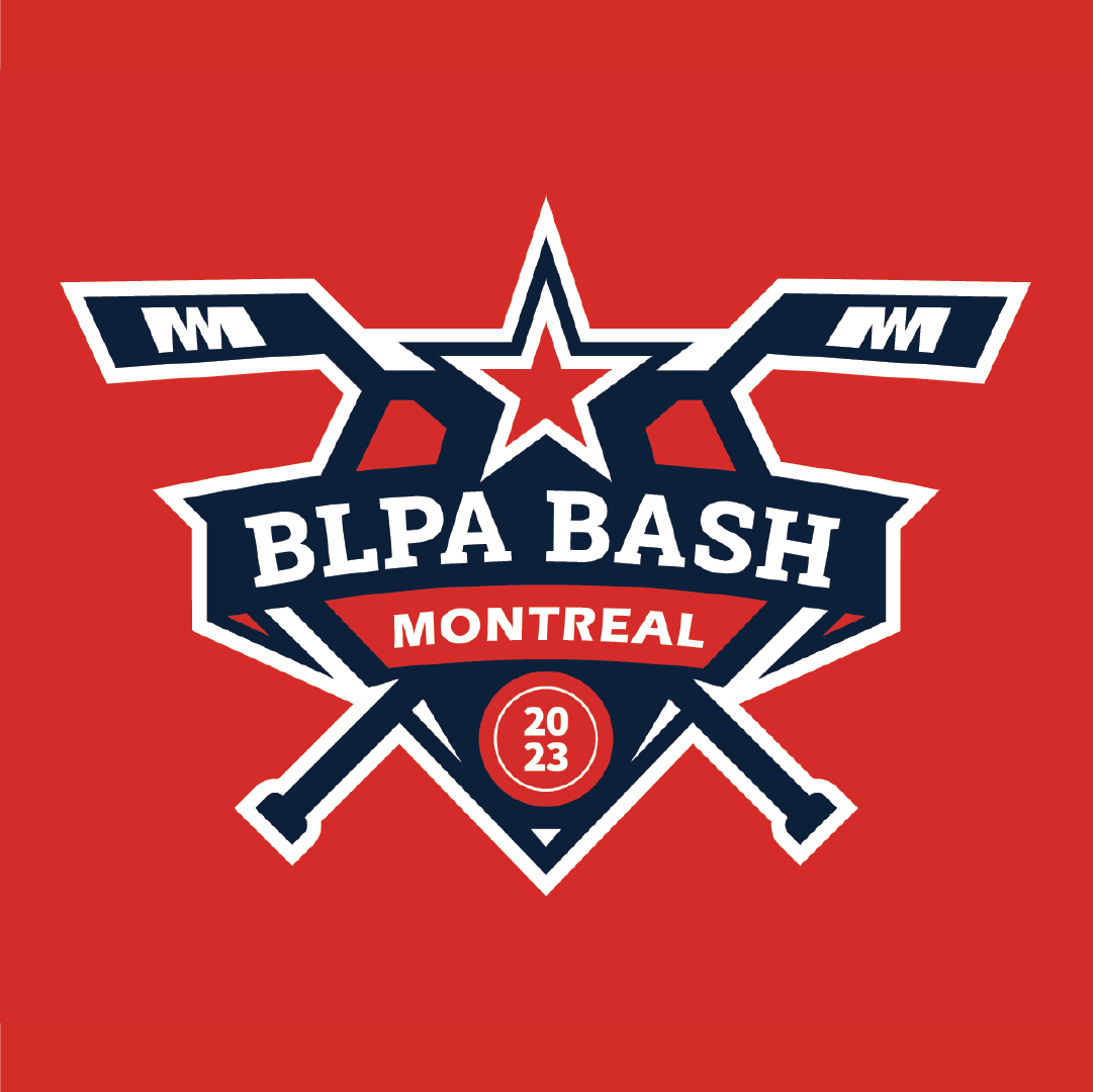
The logo is built around a shield emblem—a classic sports identity format that conveys strength, pride, and competition. It integrates iconic hockey elements with a modern, energetic design style:
Hockey Sticks: Forming the upper and lower structure, representing the sport’s foundation.
Star Motif: Symbolizing excellence, teamwork, and the celebratory atmosphere of the tournament.
Typography: Bold and dynamic lettering for “BLPA Bash” with a secondary placement for “Montreal,” giving both international recognition and local pride.
Year Badge (2023): Encased in a hockey puck form for clarity and branding consistency.
Color Palette: Red, navy, and white for a strong, competitive, and patriotic feel (reflecting both hockey culture and Montreal’s vibrancy).
/ Execution
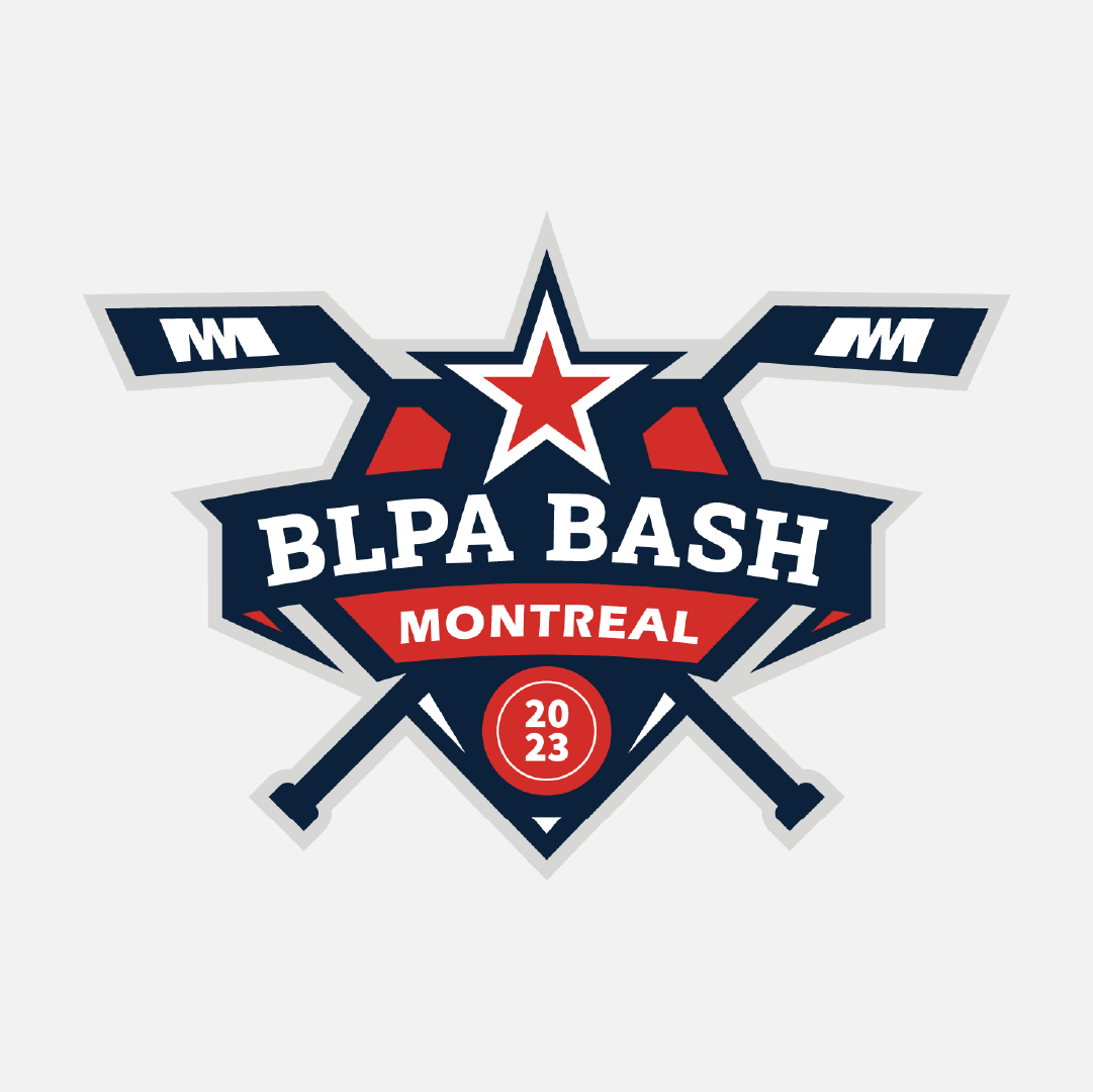
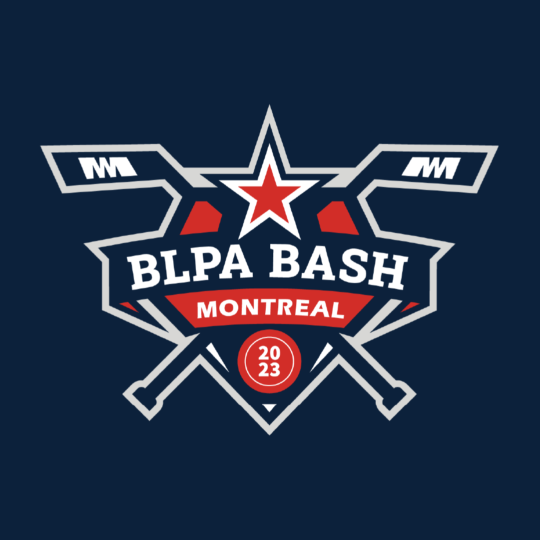
The logo was designed with versatility in mind—scalable for jerseys, merchandise, promotional materials, and digital platforms. Its structured yet energetic composition ensures it works equally well in large-scale banners or small social media graphics.
/ Final Outcome
The BLPA Bash Montreal 2023 logo successfully conveys community, competition, and hockey passion. It stands as a strong visual identity for the event, uniting players and fans under a memorable and striking brand mark.